When deciding how to paint your home’s interior walls, the variety of finishes available can…
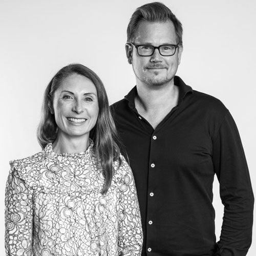
Interview with Staffan Tollgård – Tollgård Design Group
Hello! Can you tell us about yourself?
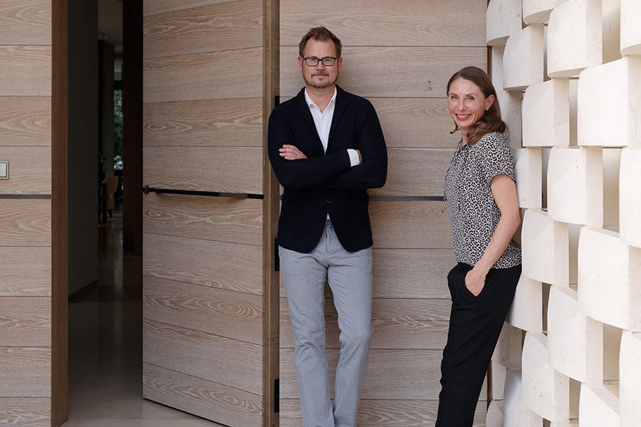
I’m Staffan Tollgård, co-founder and creative director of a multi-disciplinary design studio called Tollgård Design Group. I run the Design Group with my wife, Monique, and an amazing team of creatives. We are really proud that we will be celebrating fifteen years of the business early next year.
I trained in Architectural Interior Design at the Inchbald School of Design and then set up my own company shortly after leaving. We offered architectural interior design services, and were very fortunate to be spotted by House and Garden quite quickly as one of the Top Ten designers in the industry to watch. Since then we have worked on some incredible residential and commercial projects around London, and increasingly, around the world. Our clients tend to be quite international – with me as a Swede, and Monique a South African, we have also tended to an international group of designers when we look for new talent. While our projects remain satisfyingly diverse, we do a lot of work for families. This is where our approach adds a lot of value, and where we have come to specialise.
In the last few years we have expanded our design offering to include a showroom in Pimlico where we also have our design studio, as well as a Contract division and a dedicated Product Design division. Last year we had the opportunity to partner with Ceccotti Collezioni and we relaunched their mono brand showroom in Chelsea Harbour. My wife jokes that I leave the house and come back either with a new brand or having opened a store. But I am relentlessly optimistic, and I love great design. If it means bringing it home with me, or opening up another store to house it, so be it!
This is me with one of the rugs we designed for JAB
What’s your backstory and what attracted you to design?
I was brought up in Stockholm, on a beautiful island outside the city centre. From a very early age I was more interested in design that my parents or my peers. I persuaded my mother to let me choose my wallpaper at age seven. We should really have known that engineering wasn’t going to satisfy a very obvious creative urge in me. I studied Film at Bournemouth for two years before meeting Monique on a film set. She was an actress; I was the First AD. We joke that while neither career lasted, our marriage has done: we celebrate 17 years in the spring of 2020.
While renovating our first house together we realised that I had a knack for understanding space and getting the most out of our budget and the very crooked Victorian house we had bought. After she read an article on the new crop of designers out of Inchbald I was convinced. I trained there and have never looked back. Monique then left her job in documentaries and trained at the Inchbald before coming to join me – now twelve years ago.
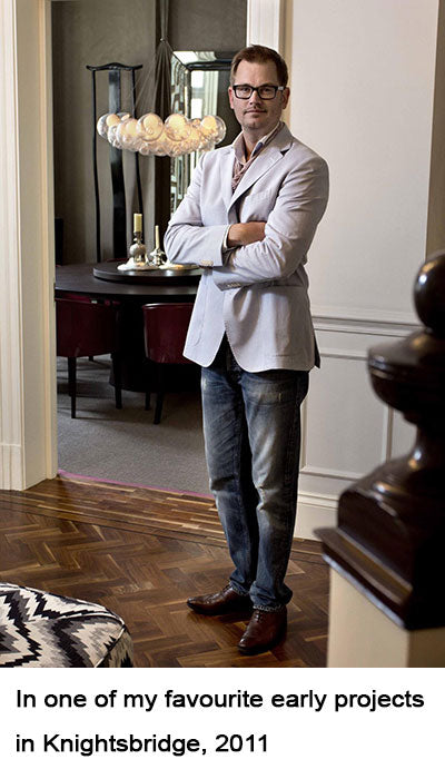
I worked for an industry icon, Rabih Hage, after leaving Inchbald. One of the first projects I worked on with him was the Design Club at the Harbour. It’s wonderful to go back there and see some of those design decisions still hard at work. When I started my own business I was fortunate to work on the refurbishment of a beautiful apartment in the heart of Chelsea. I was on my own with nearly 4000 square feet to transform. A few months into the project I took on an intern from Inchbald – she went on to be our first employee and stayed for more than a decade. You can see her on my left in the picture below. We handled everything from planning permission to cushion trimming on that first project – a baptism by fire, but I think my career was forged there. The attention to detail demanded was enormous, but it is still one of my favourite projects.
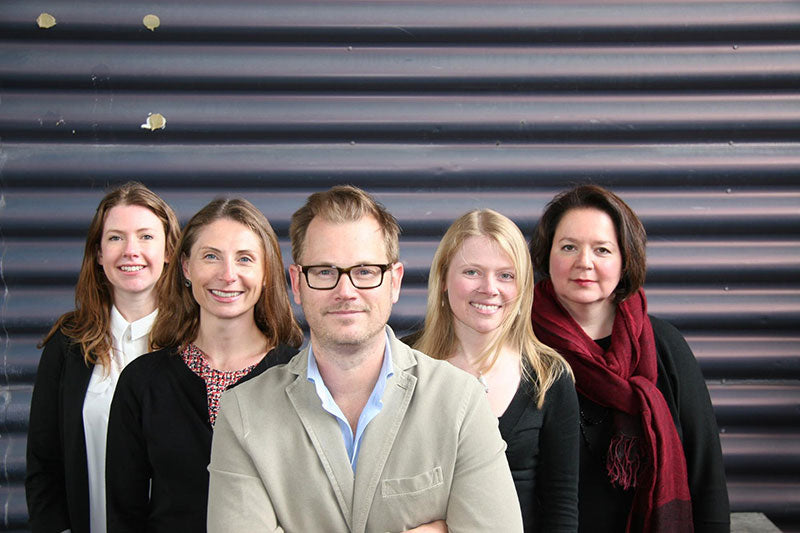 Me and the senior design team, 2012 outside Westbourne Studios, our company HQ
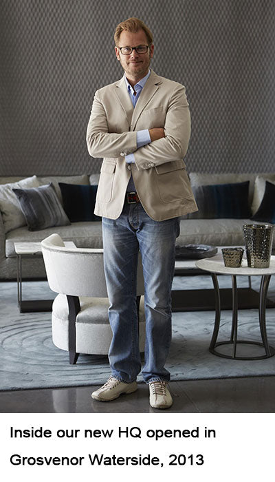
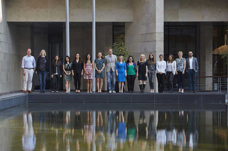 A few years later a larger team on the water outside our new HQ in Grosvenor Waterside.
What do you love most about designing?
I love the combination of macro and micro. That you are able to plan a project from the start and be involved in every detail of it – from concept to completion. I think it’s the ultimate satisfaction of creating order from chaos.
More than anything, though, I love when a design that our studio has created has a fundamental, positive impact on how the client lives in their home.
Who, for you, has been the most influential designer/designers?
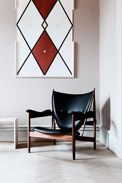
I never cease to be amazed by the pioneering work of Danish architect and designer Finn Juhl and am lucky enough to have one of his pieces in my home. His chair, the Chieftain, turned 70 this year and it is one of the most beautiful and exceptional pieces of furniture I have come across in my career as a designer.
The Chieftain chair by Finn Juhl
I always find the work of Christian Liaigre intriguing and inspiring. He has succeeded in drawing inspiration from the East and enfusing it into his revisioning of Western design-scapes. His designs for furniture and interiors feel authentic, satisfyingly formal and effortlessly elegant.
The combination of these two figures pretty much captures my personal style. A Scandinavian, Eastern-inspired blend, influenced by the tenets of sculpture and functionalism – all in the pursuit of spaces that live truly well.
Where/how do you find inspiration for new designs?
There is always a question of living that I am busy teasing out in my mind. As an interior designer I am trying to answer the questions of living that are unique or personal to my client. As a product designer I am trying to find answers to more general, or universal questions.
I travel extensively for work and with our family, so am always on the lookout for how particular cultures and places have dealt with questions like screening from sunshine, creative privacy, and framing or lionising the view beyond. I collect answers and tuck them away for the next time a particular question arises.
I also try and work outside the office in the V&A, or other libraries. I find that being surrounded by design, architecture and art incredibly relaxing and inspiring. Whenever a new design project starts I try and make time outside the office to be creative. It sounds counter intuitive, but office life is often spent reacting to problems or questions from other people. To find a quiet mental space to be creative requires leaving the studio!
My path to a design starts with bringing together all the ingredients from the client’s choice of home (architecture), setting (environment) and their personality. I then ruthlessly edit these to find the unique creative thread that binds them. In Scandinavia we have a beautiful term for this: the red thread. It’s the DNA particular to them, and once I have found it I can weigh every future design decision against it to see whether the new ingredient follows and deepens the story the red thread is holding together.
Describe your approach to functionality v aesthetics.
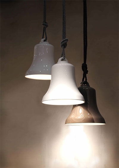
I am a great lover of functional sculpture. This perfectly sums up my approach to function and aesthetics. For me there should be no vs. going on in this relationship. I am a bit of a purist – the Swede in me – I guess, but when I designed Belle for Contardi I know that it had to be beautiful whether on or off. That to me is functional sculpture.
As a practice we are a little wary of adding decoration for its own sake. That said, the eye delights in beauty and change … so aesthetics shouldn’t be considered entirely without function.
The Belle I designed for Contardi
Describe your approach to choosing/using colours.
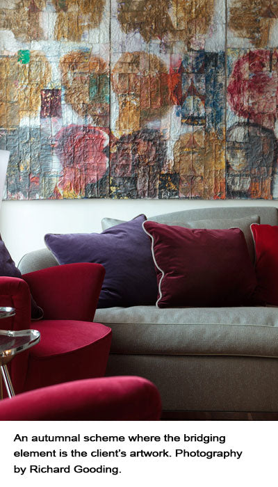
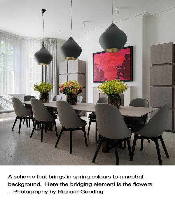
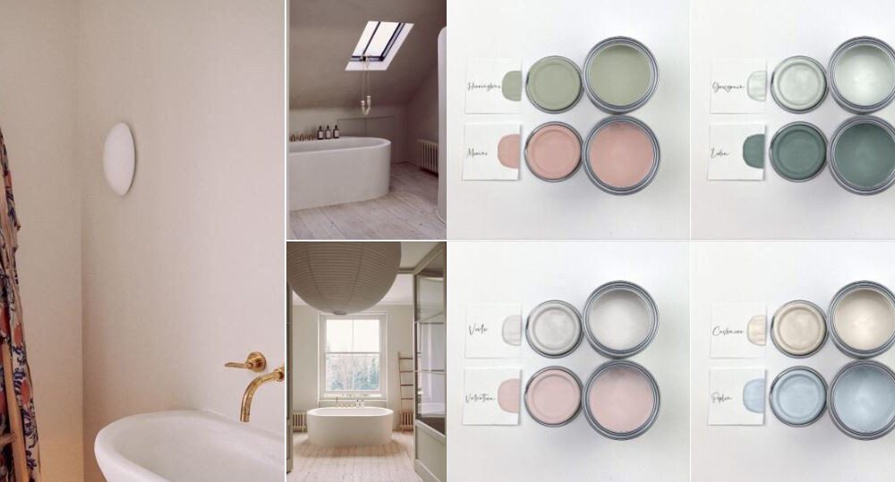
I like to be bold with colour, texture or pattern, just never all at once. Generally our schemes will start with a neutral foundation palette – either bronzes, greys or lighter neutrals. We favour natural materials like wood, stone, metal and leather which quite often precludes punchier colours. From this palette we add texture and pattern, often with hand carved or worked details. Colour is introduced through fabrics, furniture, rugs and curtains. We often talk about a bridging element, which can be a fabric or a piece of art. This contains all the colours that we are working with in a scheme and avoids the feeling that a colour has been added out of nowhere.
We also like to think about colours in terms of seasons. Monique was very inspired by her lecturer at Inchbald, Nico Springman. He saw colours and harder materials in terms of seasons that went together. A rich walnut wood floor lends itself to an autumnal palette of deep aubergines, russet reds and burnt orange. If you wanted to add a blue here it would be navy, rather than an acqua. That colour would sit in Spring.
How are green awareness and the increasing popularity of eco-friendly products affecting the design process(now, and in the future)?
We have a new saying in the office. ‘What would Greta say?’ It’s a little tongue-in-cheek as Greta Thunberg would no doubt have a heart attack at the idea of refurbishing perfectly liveable homes or shipping furniture in from across the world. However … the question is very important to ask as often as we can. How can we lighten our footprint? How can we make sure that our clients make good decisions and buy once, for life rather than for the next five months or five years? Can we find a stone that’s local to the project rather than shipping it in from Italy? Can we make sure that we use wood that’s responsibly sourced and has environmentally sound staining or pigmenting processes?
When we work on the architectural interior design we are able to ask our clients how they plan to cool and heat their houses, and we always question the necessity for AC and make sure that there are older answers that are explored first: overhanging canopies, window screens, courtyards, windows that open at high level to create a chimney effect… These are old answers to questions of living that have been tried and tested over generations.
Eco-friendly design is one of the most important movements in our industry, and the more we all as designers and specifiers try and be aware of the revolution and bring our clients on board, the better.
Take us through your process of designing for a client.
When we work with a client, we have a few ways to try and get to know them as soon as possible. We’ve developed a client wish list – a mixture of needs, desires and objectives – that allows us to understand the different people that make up the residence and try and tease out what it is each of them needs and wants for this new iteration of home. We ask lots of questions about design but also about hobbies, rituals and spaces that they need to be interesting people and a connected family. We heatmap their existing home to see which spaces are over or under used and then make sure this functional map is more logically expressed in the new layouts.
We present in a few different stages to make sure that we don’t do lots of detailed work down the wrong direction. At concept stage we will present two slightly different red thread ‘avenues’ to allow the client some space and to see how the red thread of architecture, environment and identity can be expressed differently.
Once concept has been confirmed we move forward to the design development stage. We might be working only on FF&E, in which case we will start choosing actual pieces of furniture, or we might be working on the architectural interior design, so we will start designing the bathrooms, kitchen and choosing the interiors palette.
We communicate with our client using highly visual presentations – the most effective and memorable way. We use sketch up for our 3D work, and we render our CAD plans with the chosen materials to help move the client into the space.
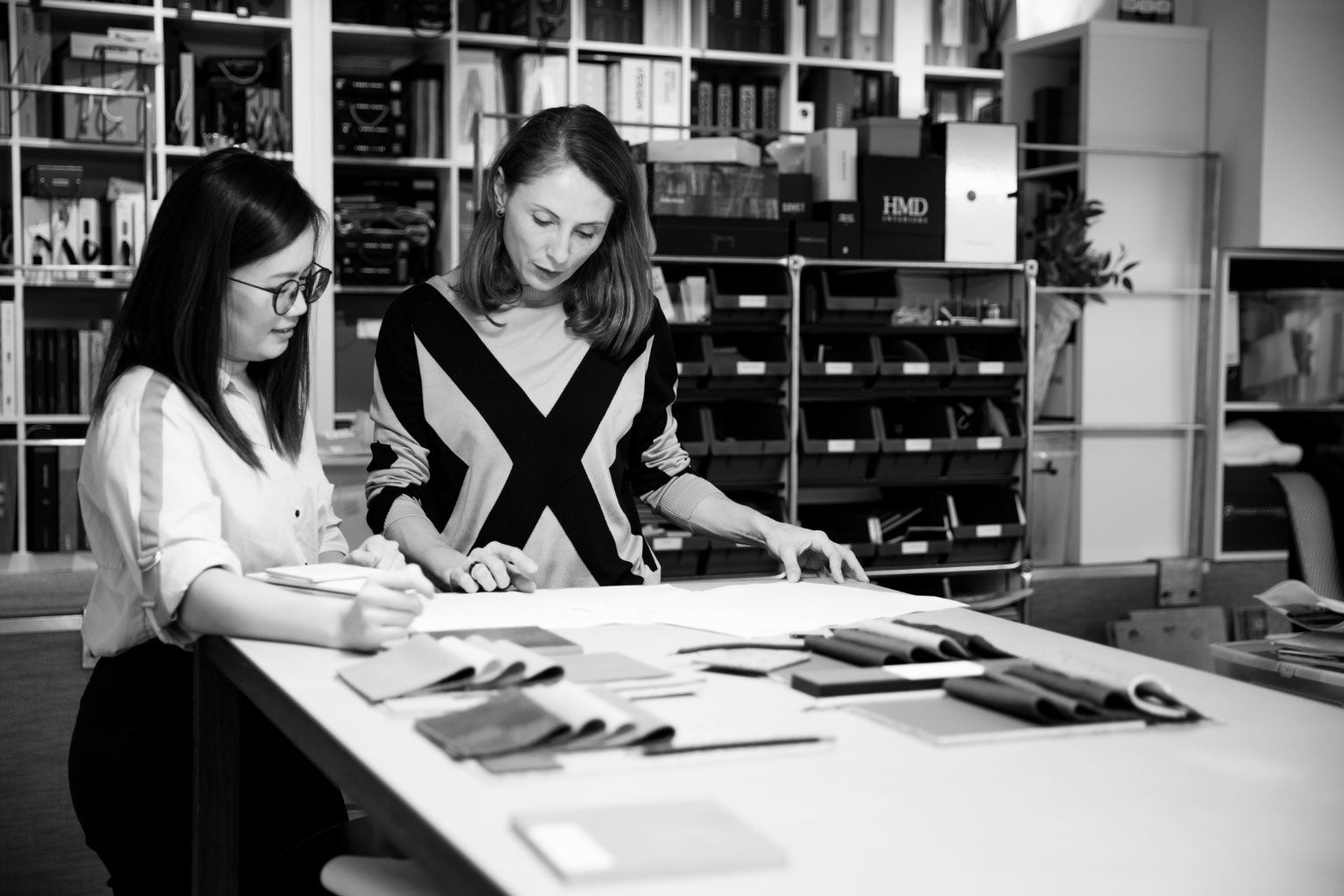
Sharon and Monique working on a FF&E scheme for clients
With contractors and other members of the design team we tend to favour CAD, but we have found that sharing the client presentations with the rest of the design team gives a better overall sense of the red thread and mood of the project than CAD on its own.
What do you like to hear people say when they view your work?
I love it when a family tells us that they are enjoying their home, and that it enables them to spend time in it. That it reflects and protects who they are and how they want to live. We have been working with one family on several projects over a few years now. The client said to us that he wakes up in the house we designed for him in London, goes to work in the office we refurbished for him, and goes on holiday in the sand dune retreat we worked on together with an awesome Danish architect. ‘In fact, Staffan’, he said, ‘you are the red thread that runs through our lives’. This was a pretty great thing to hear.
What is your all-time favourite design (yours)?
I loved the summer retreat in Denmark that we designed together with Knud Holsher, probably Denmark’s greatest living architect. Poignantly it may well be his last project, as he came out of retirement especially for it. The island reminds me of the summer house in Sweden where we used to holiday as children, and in general it was an incredibly creative and collaborative project. Amazing clients, a wonderful design team and great contractors.
Photography by Richard Gooding
Moreover, it’s a perfect example of where the interiors put family-life first. A special place for the family to spend their summers, the island is surrounded by sand dunes and is a place to decompress, to connect with nature, to put down cell phones and look out at the bigger more important picture. To be with their children, to be more at peace and live a simpler life. I read an amazing book by Alain de Botton called The Architecture of Happiness, and believe that this summer house expresses his argument perfectly:
“Belief in the significance of architecture is premised on the notion that we are, for better or worse, different people in different places – and on the conviction that it is architecture’s task to render vivid to us who we might ideally be.”
Me during the photoshoot of the house on Fanø.
Through real-life design projects, have you learned anything particularly helpful or advantageous?
I read a wonderful quote just this morning from Nelson Mandela:
“I never lose. I either win or I learn”.
It perfectly sums up our attitude to this amazing industry. With so many decisions to make and processes to work through it is inevitable that we will make mistakes. The challenge is to learn from them and to make new ones!
We have a Lessons Learned bible that we update after every project – we are passionate about increasing our stable of knowledge for our own development and for the benefit of our clients. Some nuggets from there include –
- Don’t pretend that nature is perfect and bulletproof. Be realistic with your clients about the maintenance required for wood, marble, leather and metal. If they are perfectionists – listen to them and make sure their material palette is as low maintenance as possible.
- Give the maintenance and cleaning instructions at the same time as you have any furniture delivered. Not afterwards once the wine has already been spilled on the new rug.
- Always make the laundry bigger
- Always have a back kitchen, pantry or scullery if space allows
- More storage is not always a good thing. Encourage clients to throw or give things away that they don’t need.
- Think about sound and how to soften it. Too many hard materials result in uncomfortable spaces.
- Don’t put downlights in ceilings unless you know what you are lighting.
Advice for readers who want to redesign their homes/workplaces?
- Make a list of things you need and things you want (things that give you joy). Work out a budget and make sure you have a realistic amount of money set aside for the things you need and some for those that give you joy.
- Get accurate drawings of the space you are redesigning and try any new pieces out to scale.
- Gather samples of key materials (wood flooring, stone island etc) and carry them with you when you go to showrooms and places where you need to test the materials out against each other. Your back won’t thank you, but it’s the only way to make sure you have a coherent scheme when you have to make individual choices in different showrooms and shops.
- Measure the seat heights of the sofa and the chairs in the same seating area. Try not to have them more than 7cm difference. If you are going to have people there that have limited mobility always consider chairs with arms for support.
- L shaped sofas are great for TV watching, but not so great for entertaining as no one will sit in the corner or so close to each other next to it. Two straight sofas can be better.
- Before you buy always try and mock up the pieces in the space so that you get a sense of the volume of them. Depth of sofas is very important.
- ENJOY the design journey! Use Pinterest or a folder on your phone to collect all the things that you’ve seen so that you can easily find what you’ve bought, what you want, images of the space and any plans you have. Dropbox is also good for sharing information with family, friends or design consultants.
What interesting projects are you working on right now? And what does the future look like?
We are working on some fantastic projects at the moment and feel very privileged to have a great mix of residential and commercial, as well as local and international work. One of our favourites is a historically important apartment in the centre of Copenhagen. We are working again with our favourite cabinet makers KBH and bringing some London design energy to this elegant building. In London we are designing the headquarters of a vibrant, rapidly growing tech firm, together with architects BDG, as well as bringing two impressive family homes into the twenty-first century (with the ubiquitous basement extension) creatively and sympathetically.
The future (fingers always firmly crossed) looks very exciting. Our contracts business under Max Pilbeam is going from strength to strength and we have opened a third showroom in Chelsea Harbour. I am really enjoying the product design division together with Filippo Castellani and am very excited to show our newest pieces for Porada in Saloni in the spring.
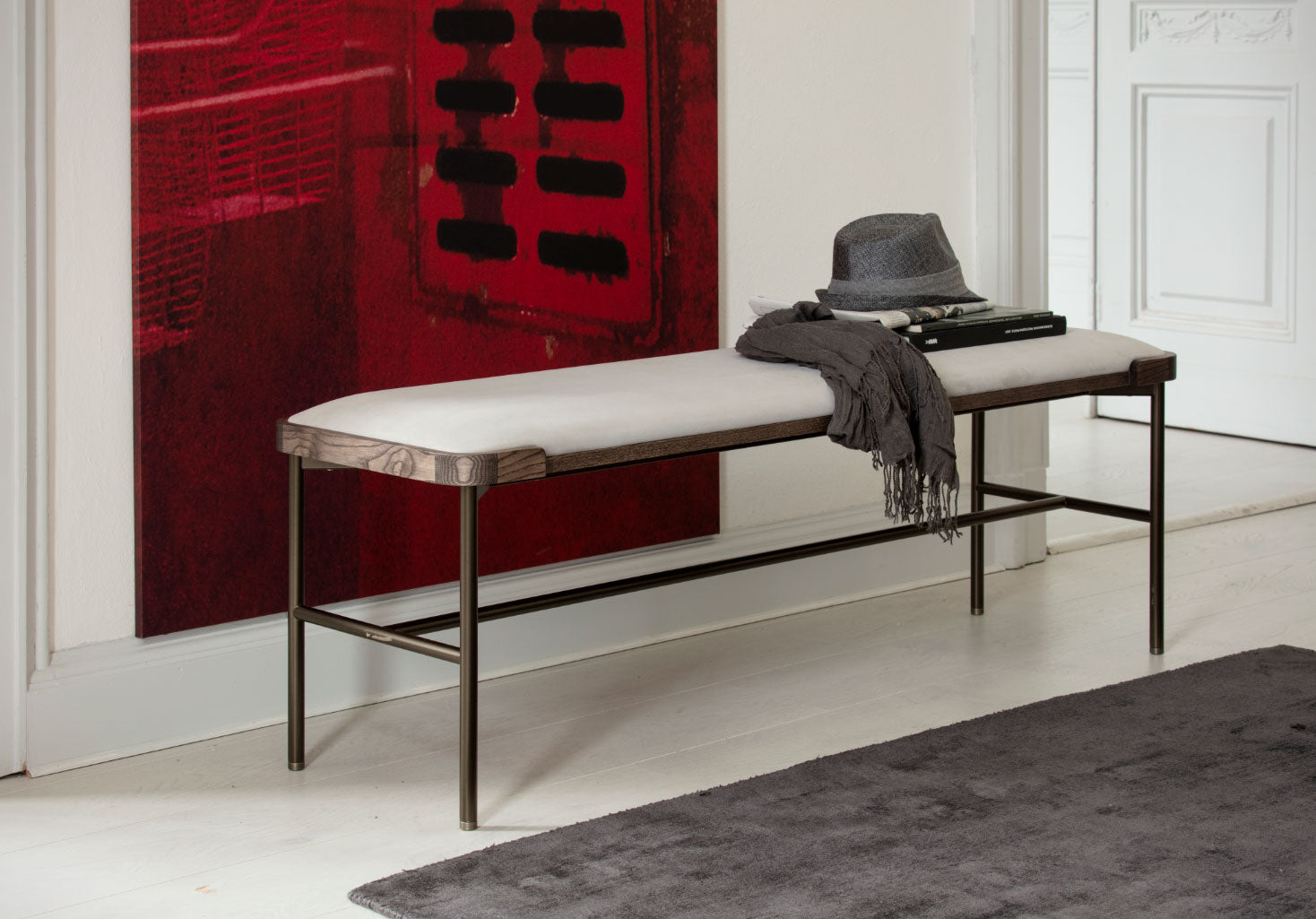
The Astol Bench designed by Tollgard Products for Porada
I have a tendency to jump at interesting prospects and adventures – my head and heart yell ‘why not?’ as Monique works out the ‘how’ and ‘when’ in the background. I feel so incredibly lucky to work in a field filled with creative people and interesting clients. I plan to be doing this until my children boot me out of the company. At least till I’m 85. After that – we’ll see …
Monique and I after a photoshoot in Jordan. Photography by Richard Gooding.






This Post Has 0 Comments