
Graphenstone Paint Selection
We plant a tree for every
Peel & Stick Colour Sample you buy!

Peel & Stick Colour Samples - good for the environment
Our Peel & Stick Colour Samples make it so easy to see and choose the right colour but they provide major environmental advantages:
- Made using 30% recycled material.
- 100% recyclable
Use around 94% less paint than an average sample pot - Have a much lower CO2e – up to 98% less – than a pot of paint
- Use tiny suction cup technology so no glues or adhesives – will not mark your walls
- It can be used an infinite number of times
- Contain zero carcinogens or PVC
- Produce no waste when compared to a sample pot

Graphenstone: Eco-Friendly Excellence for a Sustainable Future
We source sustainable, traditional raw materials such as lime, calcium carbonates, and natural minerals. Graphenstone fuses these clean ingredients with inert carbon ‘graphene’, delivering a natural mineral-based coating with Class 1 durability. It’s the ultimate in material innovation, utilising 21st-century, Nobel Prize-winning carbon technology.
Certified by Cradle to Cradle, we manufacture sustainable and healthy paints which actively purify your surrounding air.

Adonis
This fresh mid-blue, reminiscent of the azure heavens that watched over ancient British landscapes, carries the essence of tranquillity and depth. Its rich heritage, informed by the pigments of yore, makes it ideal for living spaces seeking a touch of serene history when used in low-lit rooms. Adonis sits happily alongside similarly clean Porcelaine and Blue Steel.

Alabaster
Alabaster, a delicate white softened by grey, echoes the serene beauty of historic statuary. Suggesting a harmonious blend with deep forest greens or rich burgundies, this colour transforms spaces into calm havens reminiscent of English heritage. Alabaster can be used on ceilings and woodwork with cooler greys or as a wall colour for a neutral contemporary space.

ALPINE
A subtle off-white reminiscent of mountain mists, infused with a green freshness, Glacier is a very versatile shade just a little softer than Glacier. Ideal for creating serene, light-filled rooms, it pairs beautifully with soft woodland greens or the calming blues of the sea, enhancing spaces with a natural, tranquil vibe. Perfect for living areas and kitchens.

AMCHOOR
A dusty plaster pink reminiscent of sun-faded frescoes, Amchoor is blended from yellow oxide, black, and red oxide. It is perfect for living spaces or bedrooms seeking a whisper of history and warmth. Amchoor is timeless, creating a wonderful backdrop for antique furniture. In a more contemporary home, it works incredibly well with Mulberry or Wheaten. This colour captures the essence of heritage and comfort and complements modern and traditional interiors with its subtle nod to the past.

ARCTIC
A fresh mid-blue that mirrors the vast polar skies, the Arctic is ideal for bedrooms or bathrooms. Typical of a formal Regency hue, Arctic sits happily alongside similarly clean Porcelaine and Powder Blue. This hue invites a sense of peace and spaciousness, perfect for creating a refreshing sanctuary in your home.

ARDENNES
A quite grey-brown, green-based, mirrors the Ardennes’ timeless landscape. Perfect for living rooms or studies, it pairs beautifully with soft creams for a touch of lightness or muted green for natural harmony. It will read greener when used on the walls of underlit rooms and is the perfect accent on furniture when combined with more traditional shades such as Anchoor and Argento.

ARGENTO
A warm light grey, imbued with the soft glow of morning light, Argento is crafted to evoke a gentle luminescence of silver, adding a tranquil warmth to bedrooms or living spaces. It sits with a lighter off-white and darker grey for a clean and contemporary look but also pairs beautifully with deep blues for a calming effect or warm terracotta for an inviting atmosphere. This versatile shade bridges the gap between modern elegance and the timeless charm of English heritage.
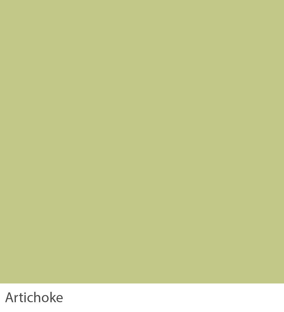
ARTICHOKE
A vibrant green echoes nature’s richness and fosters a sense of balance and harmony within the home. It is ideal for living spaces and kitchens. Artichoke is a perfect backdrop for growth, reflection, and renewal areas. It often feels much fresher and brighter in well-lit rooms and when contrasted with a bright white, such as Glacier or White Linen.

ASHEN
Ashen, a serene grey-based white, evokes the tranquillity of dawn’s first light, ideal for spaces of reflection. Its subtle urban feel, drawn from historical mists, suggests pairings with soft pastels or earthy tones, enriching living areas or bedrooms with a peaceful, airy ambience.

BENGAL
Bengal is a deep mustard yellow that mirrors the warmth and depth of the English countryside’s timeless elegance. When contrasted with a dark tone like ivory, it creates a cosy and surprisingly unyellow space. It is to be used in moderation in small rooms.

BLUE STEEL
Blue Steel is muted and calming. It suits kitchens and exterior eating areas and promotes serenity and renewal. Paired with soft greys or crisp whites, it embodies 19th-century progress with contemporary serenity. It is ideal for fostering a balanced, peaceful environment.

BLUSH
Blush, a delicate pink, evokes the serene beauty of dawn, ideal for bedrooms or living spaces. Reminiscent of an 18th-century English garden, this light pastel tone is fresh, especially when contrasted with Glacier for a playful feel. Try pairing it with our Briar Rose or Cassium for a slightly cleaner urban finish.

BORDEAUX
Bordeaux is a modern crimson that channels the robust vitality of the famed wine, infusing dining rooms or studies with a sense of depth and sophistication. Inspired by the luxurious tapestries of the 17th century, it contains less blue pigment than Carnelian, so it is brighter and more contemporary in feel.

BRIAR ROSE
Briar Rose, blending delicate pink with grey, suits living areas or bedrooms. Perfect with pale blues or rich charcoals, it reflects Victorian elegance, inspiring gentle contemplation and refined grace, creating a space of understated beauty and emotional depth.

BRUNSWICK
Brunswick, a deep, dark green, channels the majestic essence of centuries-old forests. It is perfect for studies or living rooms seeking a connection with nature’s enduring calm. Unless in very well-lit rooms, it appears almost black. Paired with rich browns or muted golds, it creates a space of sophistication and contemplation. This hue is reminiscent of the Georgian period’s affinity for nature-inspired interiors.

BURMESE
Burmese, a rich grey-brown, is perfect for living rooms or studies and pairs well with soft creams or deep greens. It was inspired by 17th-century natural palettes, an earthy hue creating the most charismatic and elegant rooms. Burmese is also the perfect accent for both Ashen and Suede.a

BURNT UMBER
Burnt Umber, a strong grey-brown, green-based, suits living areas or libraries, offering warmth and grounding. It reflects 18th-century earth tone preferences, creating a stable, comforting environment that connects deeply with nature’s essence. It will read greener when used on the walls of underlit rooms and is the perfect accent on furniture when combined with more traditional shades such as Ivory or Wheatberry.

CAMBRIDGE
Cambridge, a pale and illuminating blue-green, brings the freshness of dawn into spaces like bathrooms or bedrooms. Inspired by the serene elegance of 19th-century academia, this soft and classic tone is ideally suited to children’s bedrooms, especially when contrasted with Oxford on furniture or woodwork.

CARNELIAN
Carnelian is a rich brown burgundy with an aged feel. Paired with creamy neutrals or deep navy, it inspires sophisticated dining experiences. Popular in mid-19th-century dining rooms, it looks almost like a saturated purple compared to the more modern-looking Tuscan Red.
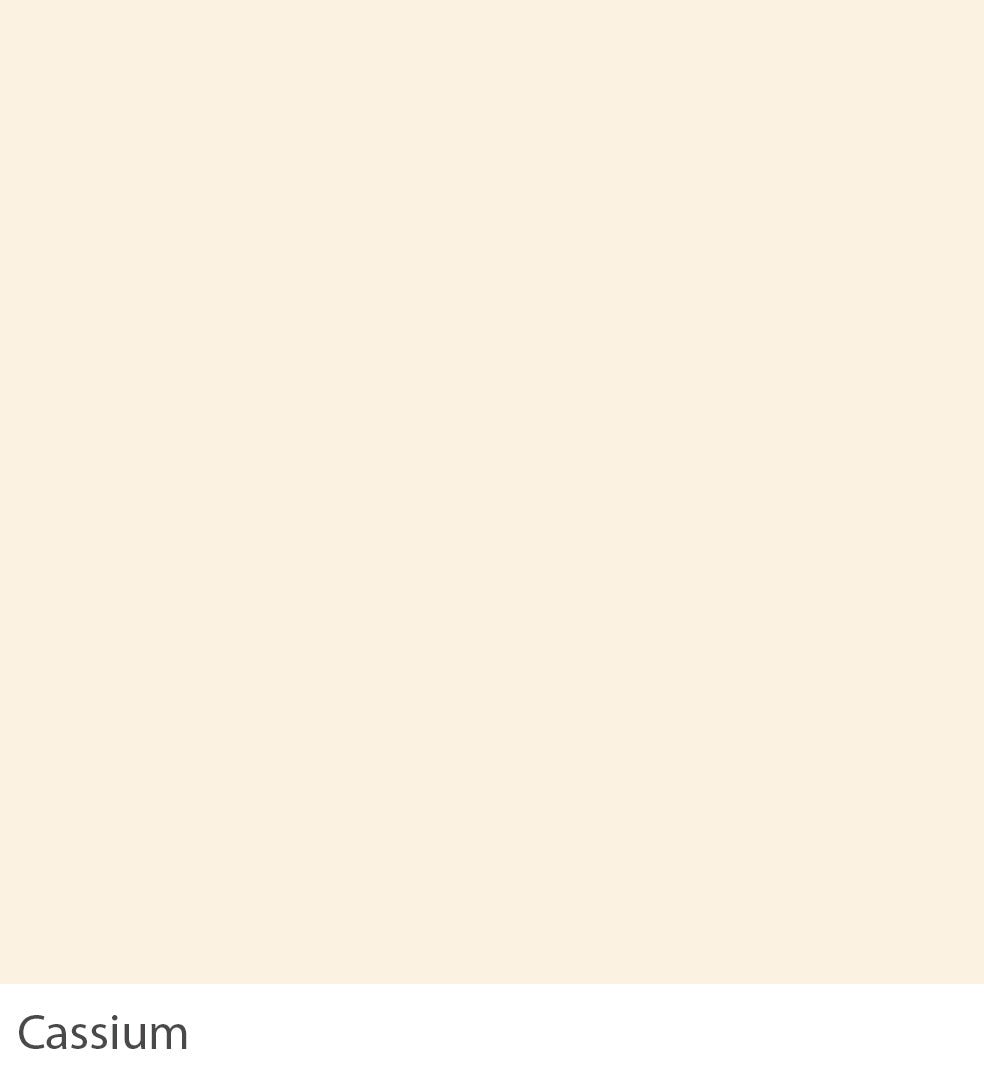
CASSIUM
Cassium is a subtle off-white with the addition of the smallest amount of warm yellow pigment. It is perfect for living areas, bringing any room a soft, luminous quality. It pairs well with soft pastels or rich jewel tones, creating a versatile backdrop that enhances natural light and space.

CELADON
In north-facing rooms, Celadon can read almost as a delicate grey. It is a lighter version of Chateaux, a gentle aqua reminiscent of early spring skies, ideally suited for bathrooms or serene reading nooks. Paired with sandy beiges or soft lavenders, it cultivates a space of renewal and relaxation.

CERULEAN
Cerulean, a greened navy blue, brings the depth of the night sky into home offices or libraries, promoting focus and creativity. Paired with crisp whites or rich golds, it creates a striking contrast, fostering an environment of sophistication and inspiration. Although traditional in feel, Cerulean is often used as an alternative to Graphene to create a richly dramatic space with a more contemporary finish.

CHALKHILL BLUE
Chalkhill Blue, a fresh mid-blue typical of a formal Regency hue, is perfect for kitchens or bathrooms. It infuses spaces with the crispness of a bright spring morning. Complemented by soft greys or warm yellows, it creates an uplifting atmosphere that revitalises the spirit. It sits happily alongside similarly clean Cassium and Whisper.

CHATEAUX
Chateaux is a fresh aqua hue that is blue-based and soft green. It captures the essence of historic elegance and is suitable for kitchens and dining areas. Pair it with natural wood finishes and soft metallics for a sophisticated, sustainable living environment, reflecting Graphenstone’s commitment to eco-friendly solutions.

CHIFFON
Chiffon, often popular in nurseries, embodies understated elegance. Its soft cream hue enhances bedrooms, creating a restful retreat. Its versatility extends to being an ideal canvas for heritage furniture and contemporary accents, embodying Graphenstone’s commitment to marrying sustainability with style.

CINNABAR
Inspired by the luxurious depths of classic crimson, Cinnabar transforms any bedroom into a haven of warmth and sophistication. It can be used to sumptuous effect in halls when offset with Pebble on woodwork or feel more edgy and graphic when paired with a bright white such as Glacier. Ideal for spaces seeking a touch of heritage with a modern twist, Cinnabar is a testament to an enduring style.
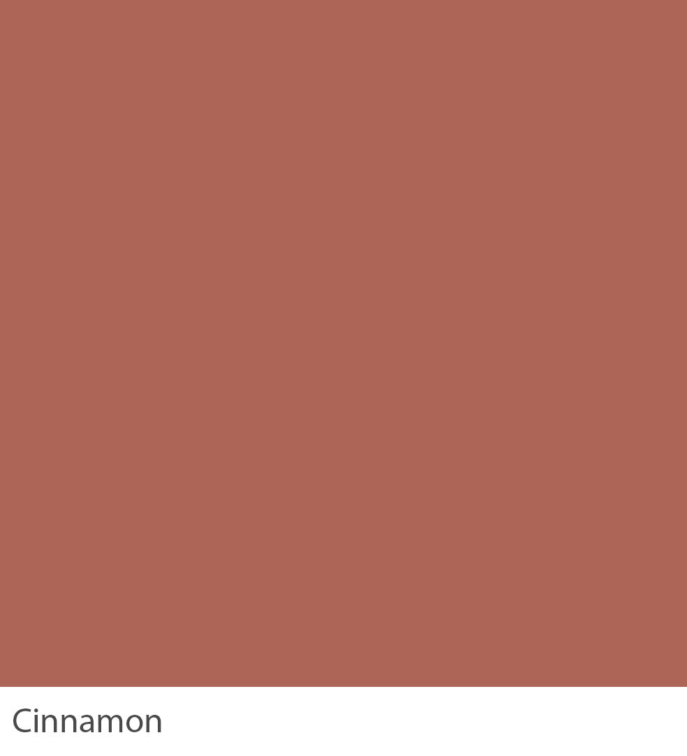
CINNAMON
Inspired by the spice, this aged terracotta hue adds warmth and depth, making it suitable for living spaces. Complements sage green and soft cream for a harmonious palette. Perfect for reading rooms or small libraries often found in English stately homes, creating an unapologetically aged feel.

CLOTTED CREAM
This pale creamy white, a yellow-based neutral reminiscent of the luxurious dessert, is perfect for creating a tranquil bedroom or living area atmosphere. It pairs splendidly with dusky pink and soft sage for a gentle, inviting palette.
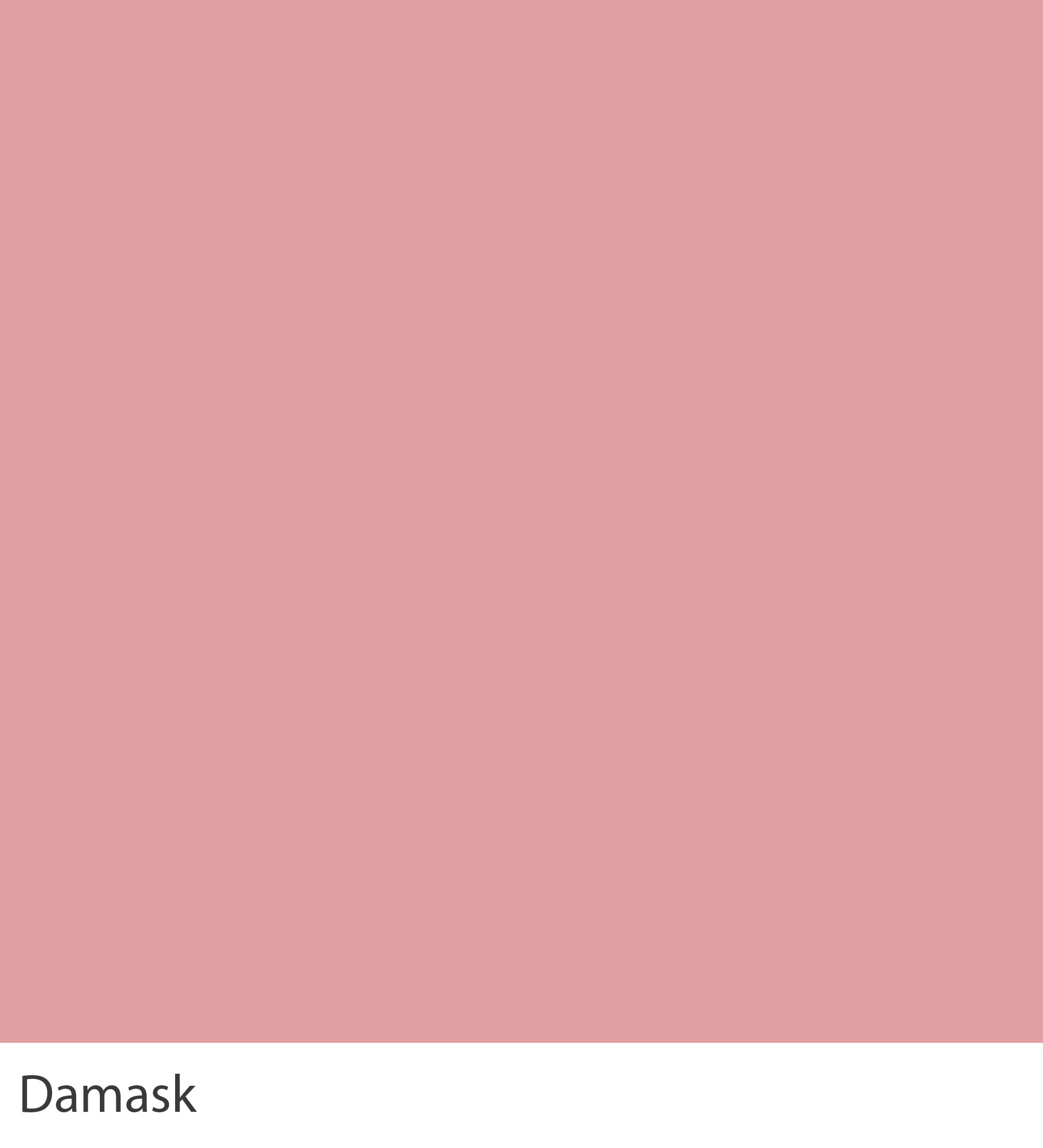
DAMASK
This classic rose pink, inspired by historic elegance, is like traditional roses; it is the perfect colour for creating a dusky feel in a bedroom, promoting a serene and loving atmosphere. Best paired with muted greens and soft whites, creating a space of comfort and gentle energy. To enhance its softness, try using Alabaster on your woodwork.

DIJON
This earthy, yellow-toned neutral, reminiscent of the mustard fields of Dijon, with a green undertone in north-facing rooms, brings warmth and emotional stability to kitchens. It perfectly complements soft greys and rich umbers, creating a comforting and nurturing environment that promotes culinary creativity and familial harmony.

DUCK EGG
This pale and illuminating blue, inspired by the calmness of a duck egg, is perfect for creating a tranquil bedroom or bathroom setting. Paired with crisp whites and soft beiges, it encourages relaxation and mental clarity, fostering a peaceful sanctuary away from the bustling outside world. This smooth and classic tone perfectly suits children’s bedrooms, especially when contrasted with Blue Steel on furniture or woodwork.

EBONY
Reminiscent of the timeless beauty of nature’s darkest hues, Ebony provides a foundation of strength and stability. As with Glacier at the other end of our colour palette, it is easy to understand and indispensable for ironwork, woodwork or even walls. Suited for drawing rooms or studies, it pairs exquisitely with muted greens or vibrant golds, encouraging creativity and a sense of well-being.

GLACIER
Evoking the serene majesty of frozen vistas, Glacier white envelops rooms in a cloak of tranquillity and light without the colder blue undertones of a brilliant white. Best suited for living spaces or bedrooms, it pairs seamlessly with Ashen and Suede. Contrast with fresh, strong tones like Burmese and Juniper for a clean, almost graphic finish.

GOSSAMER
Gossamer, an evocative pale blue that captures the essence of the early morning’s first light, is ideal for nurseries or sunrooms. This soft and classic tone perfectly suits children’s bedrooms, especially when contrasted with Oxford on furniture or woodwork.

GRAPE
Grape, a dark and sophisticated lavender, draws upon the heritage of 19th-century parlours, offering a tranquil retreat. Ideal for bedrooms, its depth pairs well with antique golds and rich creams, inviting a sense of historical luxury and modern comfort. This colour celebrates the past while creating a nurturing space for reflection and repose. It is often combined with Linwood and Ashen for a rich, contemporary feel.

GRAPHENE
Graphene is more blue than black and is a softer alternative to black. Evocative of the early Victorian era’s fascination with the unseen world, Graphene’s soft black with subtle blue undertones brings depth and sophistication to drawing rooms. Paired with muted golds or rich ivories, it creates a space that is both intimate and expansive. This colour resonates with history’s shadows, offering a canvas for quiet reflection and spirited discourse. It becomes much more relaxed in feel in an eggshell finish.

GREY GOOSE
This gentle blue-grey hue, reminiscent of the softest goose down, brings a peaceful ambience to any room. Paired with crisp whites or soft greys, it creates an airy and anchored space. This smooth and classic tone perfectly suits children’s bedrooms, especially when contrasted with Grape on furniture or woodwork.
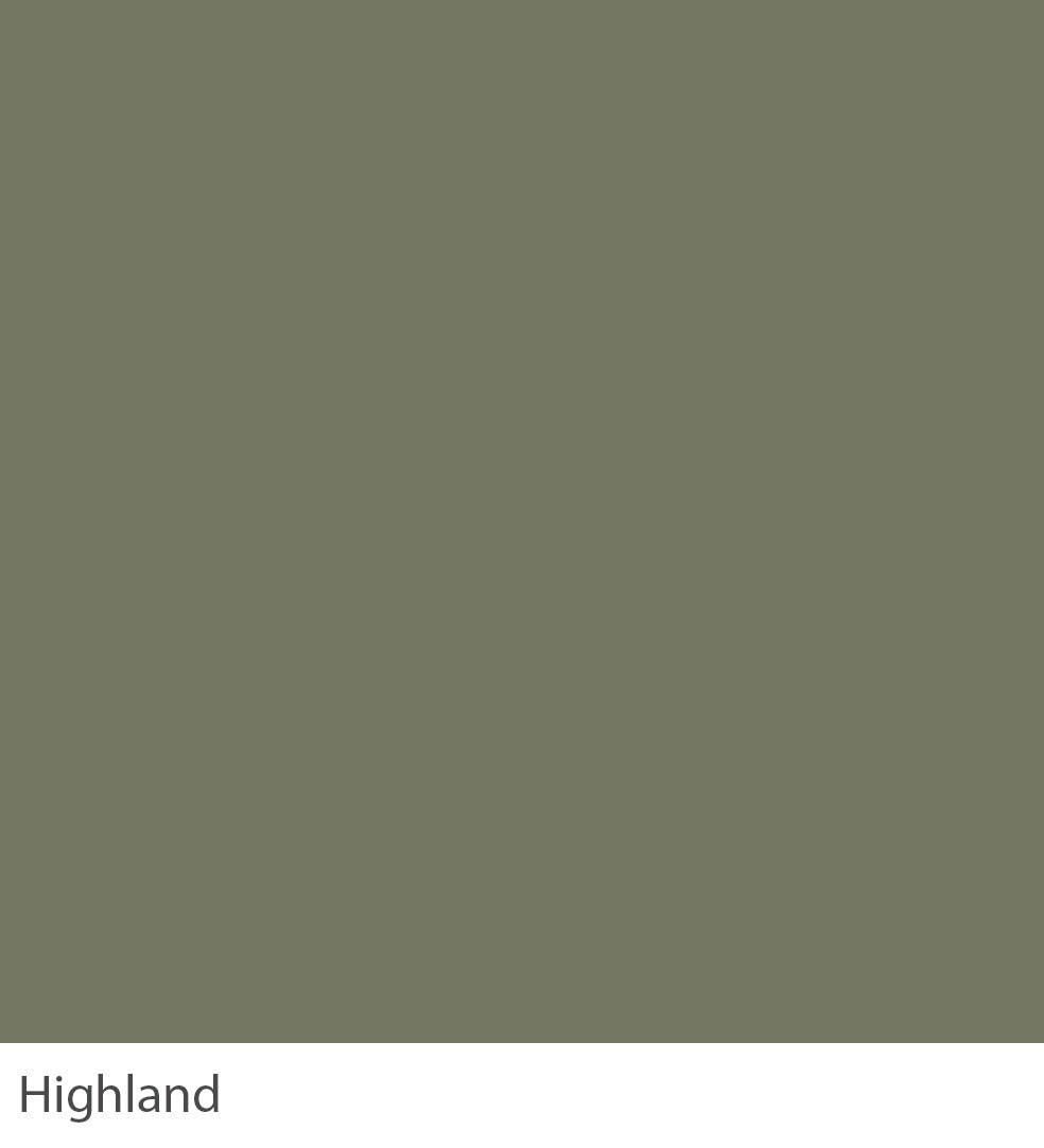
HIGHLAND
Reminiscent of the Highlands, this colour was popular in interiors during the late 19th century. This smoky green brings depth and introspection to dining areas. Harmonising with rustic oranges and deep browns, it fosters a space where old stories are shared over hearty feasts, connecting the present with the ancestral past.

ICEBERG
Reflecting the pristine beauty of its namesake, Iceberg’s faint blue essence transforms kitchens into spaces of clarity and calm. Combined with natural stone and pale wood accents, it evokes the tranquil expanses of the Arctic. Drawing on the untouched purity of 18th-century explorations, this colour offers a haven of serenity in the home. Iceberg comes into its own when contrasted with Glacier.

INDIGO
Indigo, with its rich, dark grey depths, brings sophistication and introspection to living spaces. Drawing from the 17th-century fascination with the cosmos, this colour invites reflection and conversation, making spaces both expansive and intimate. It will appear much bluer when used in well-lit home areas, working wonderfully when contrasted with Juniper.

IVORY
Ivory reflects the understated elegance of 18th-century rooms and offers a backdrop of warmth and light. Ideal for communal areas to foster openness and friendliness, it complements rich greens and deep blues, creating a delicate balance between refinement and welcoming ease.

JAIPUR
Jaipur, a zestful mint green, captures the essence of historic gardens and offers an invigorating presence in living rooms. Its vivid mint colour makes it feel just as at home on contemporary kitchen cabinets, especially when paired with Indigo, as it does on the walls of a 19th-century dining room.

JUNIPER
Reminiscent of 17th-century wood panelling, Juniper’s dark, rich brown brings timeless elegance to home libraries. It harmonises with muted greens and burnished golds, offering a sanctuary for contemplation and leisure. This colour speaks to the soul’s desire for connection to nature and history. They are often used with Briar Rose to enhance historic art and antique furniture.

KOMBU
A sage hue, a cleaned version of green Brunswick, echoing the serene essence of 18th-century walled gardens, Kombu infuses dining rooms with calm and continuity. When complemented by rustic oranges and deep browns, it cultivates an environment where meals are savoured and conversation flows freely. It is best used either on its own on both walls and woodwork or with a darker neutral like Old Bone to enhance its deep sage notes.

LATTE
Reminiscent of the soft hues found in 19th-century countryside estates, Latte’s understated elegance enhances the home office’s decor. Red-based, paired with sage greens and dusky pinks, fosters a focus and creativity space. It can be combined with Miso or Dijon to read pinker or with the darker Burnt Umber on woodwork for a slightly aged look and relaxed feel.

LINWOOD
Drawing inspiration from the mist-covered landscapes of early 19th-century paintings, Linwood offers a backdrop of gentle serenity for bedrooms. Accented with deep forest greens and warm ambers, it creates a nurturing haven that encourages rest and rejuvenation. A modern neutral, it sits with the lighter Alabaster and Otter for a clean and contemporary look but can also be used in a darker statement scheme alongside Burmese.
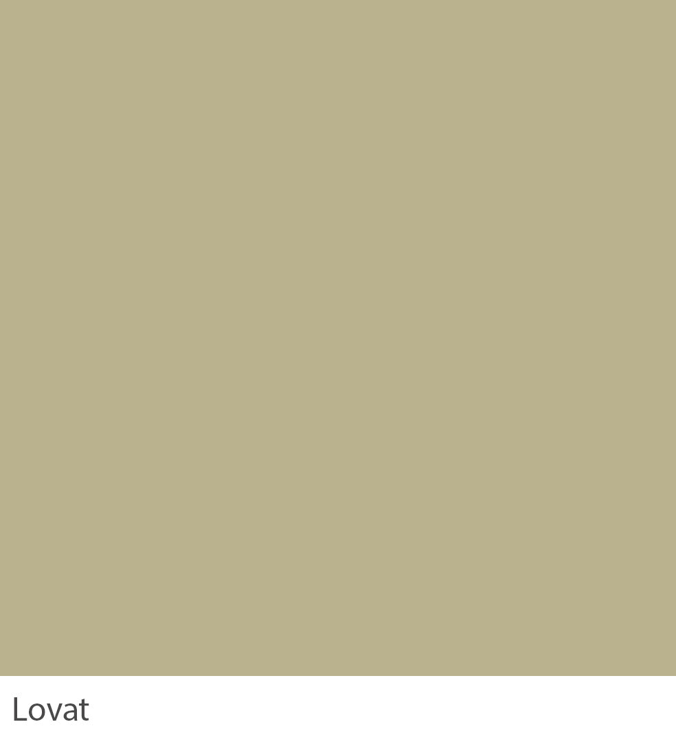
LOVAT
Inspired by the stately homes of the 18th century, Lovat brings an element of classic sophistication to living areas. Less green than Ardennes and with an unsurpassed depth of colour, Lovat’s rich and chalky hue sits just as well in a contemporary room as in a historic house. This Colour encourages a contemplative mood, perfect for spaces dedicated to relaxation and thoughtful engagement with the world.
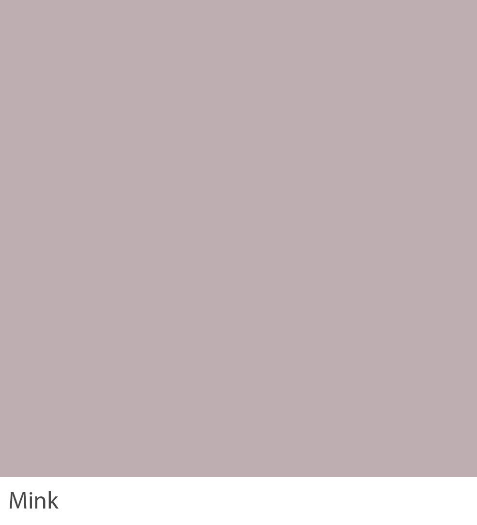
MINK
Echoing the luxurious textiles of the Victorian era, Mink infuses spaces with warmth and sophistication. Ideal for entryways, it creates a welcoming first impression when matched with dark greens and rich golds, offering a modern take on traditional luxury. Pair with Stone for the most flattering and subtle scheme.

MISO
Miso, a serene grey-brown with a red-based tone, draws inspiration from the tranquil retreats of 18th-century monasteries, offering a soothing presence in bedrooms. It will read greener when used on the walls of underlit rooms and is the perfect accent on furniture or floors when combined with more traditional shades such as Alabaster or Clotted Cream.

MIST
Inspired by the early morning fog over 18th-century English landscapes. Mist appears to be a very pale lilac when contrasted with our Glacier, making it perfect for children’s bedrooms when wanting to keep a neutral scheme. This colour invites introspection and a deep connection to nature’s serene and ephemeral beauty.
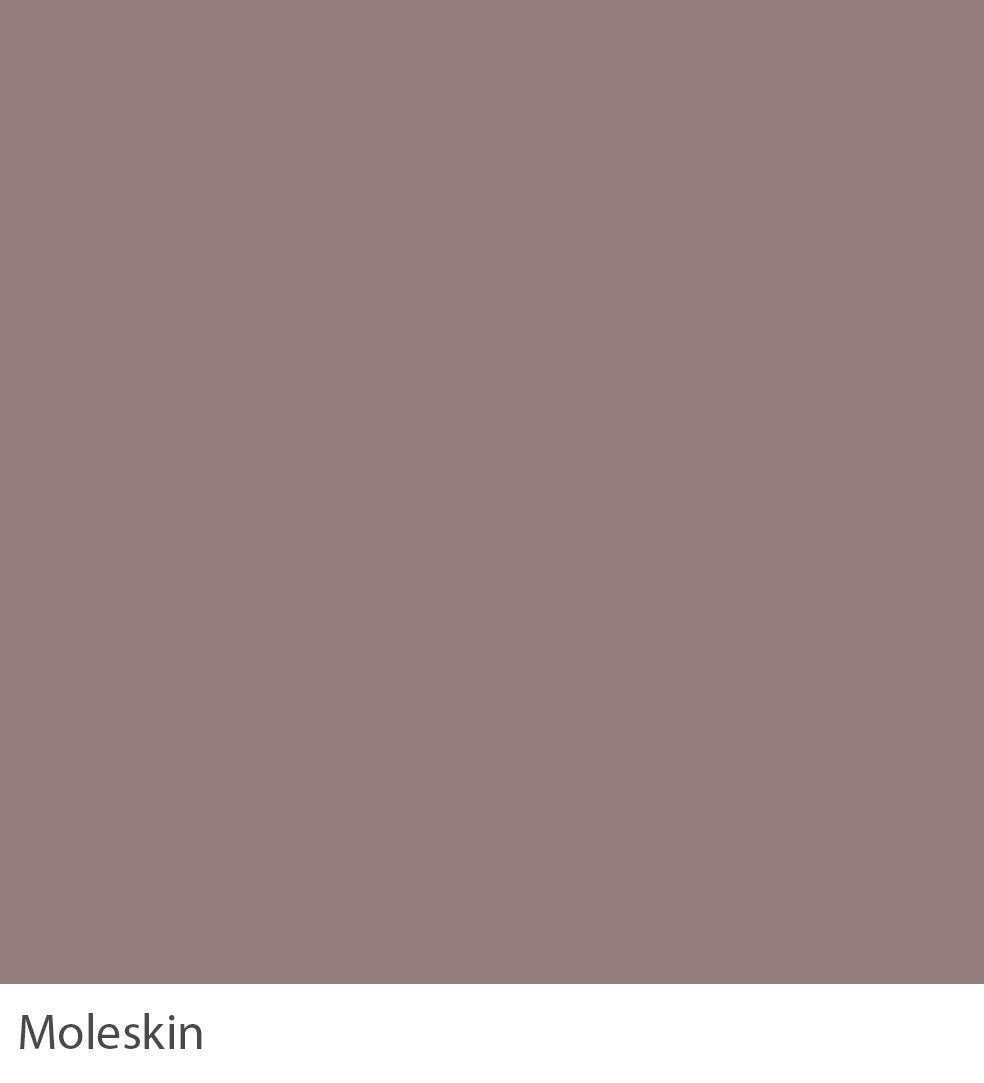
MOLESKIN
A warm and muted brown grey, used in the opulent interiors of 19th-century drawing rooms, is trendy in modern living rooms. Moleskin provides a backdrop of stately elegance for dining areas. It is the perfect accent colour for all the warm neutral colours or can be used on woodwork with rich Juniper.

MULBERRY
Drawing from the regal elegance of Victorian salons, Mulberry transforms living areas into spaces of sophisticated conversation and reflection. It can create a warm and highly refined finish on all walls but is often used as a feature wall to enhance a neutral Pale Walnut scheme or as an accent on the underside of a bath or kitchen island.

NAKAJIMA
Inspired by the peaceful retreats of Japanese gardens, Nakajima’s subdued blue-green offers a contemplative backdrop for living rooms. When complemented by rich woods and soft beiges, it fosters a harmonious environment that encourages relaxation and mindfulness. Very cheerful and welcoming, it is a great favourite for kitchens.

OCEAN
Echoing the boundless energy of the sea, Ocean infuses dining rooms with a dynamic, uplifting atmosphere. Complemented by warm yellows and crisp whites, it creates a lively space for gatherings, where meals are enjoyed against spirited conversation. This colour, reminiscent of 18th-century seascapes, invites the same sense of exploration and wonder, making every moment at home an opportunity for discovery and joy.
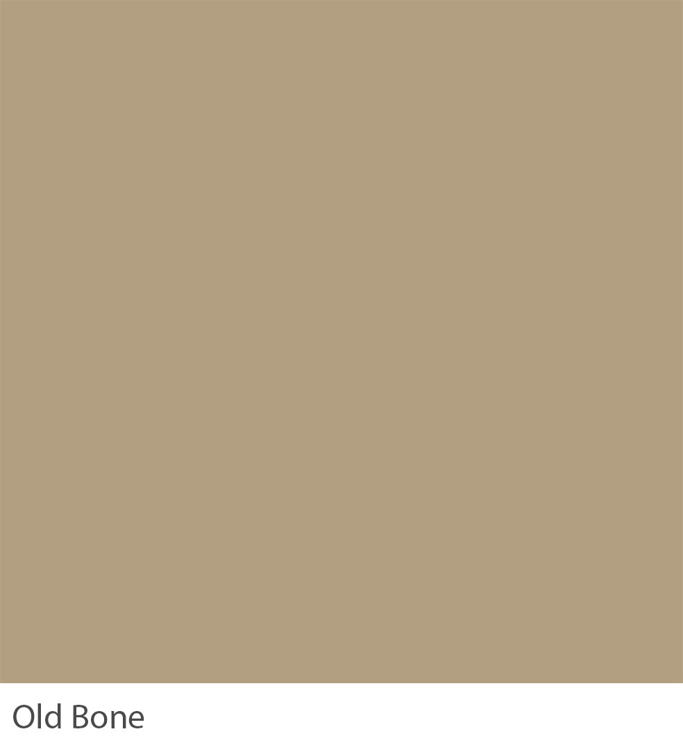
OLD BONE
Reminiscent of the architectural grandeur of Georgian estates, Old Bone’s traditional grey lends a dignified air to entrance halls. Less blue than Truffle and with an unsurpassed depth of colour, it is a rich and chalky hue that sits just as well in a contemporary room as in a historic house.
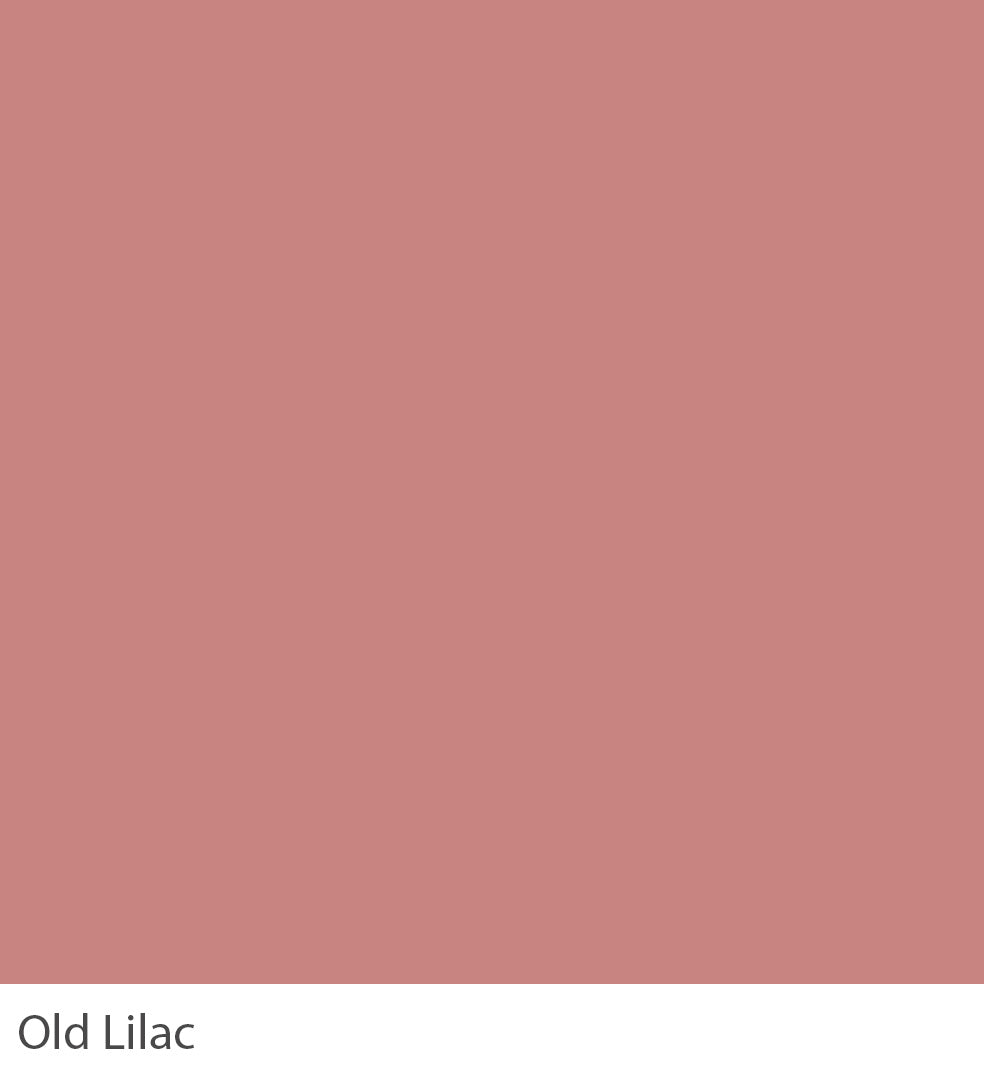
OLD LILAC
Drawing inspiration from the ornamental gardens of the 19th century, Old Lilac brings gentle warmth to dining areas. It is the perfect colour for creating a dusky feel in a bedroom and is also much favoured in garden rooms when paired with complementary Truffle or Old Bone. To enhance its softness, try using White Pepper on your woodwork.

OLIVE
Echoing the lush landscapes of the English countryside, Olive offers a serene backdrop for studies, encouraging concentration and creativity. It looks most at home when paired with a traditional neutral such as Ashen or Argento.

OTTER
A warm and muted grey inspired by the hues of twilight landscapes, Otter transforms living spaces into quiet, sophisticated and comfortable areas. It is the perfect accent colour for all the warm neutrals such as Argento and Ashen, and it can be used on woodwork with rich Mink.

OXFORD
Drawing from the academic heritage of its namesake, Oxford infuses dining rooms with a sense of tradition and intellectual curiosity. Oxford is often used as an alternative to Ebony to create a richly dramatic space with a more contemporary finish. It will appear much bluer when used in well-lit home areas, working wonderfully when contrasted with Pigeon.
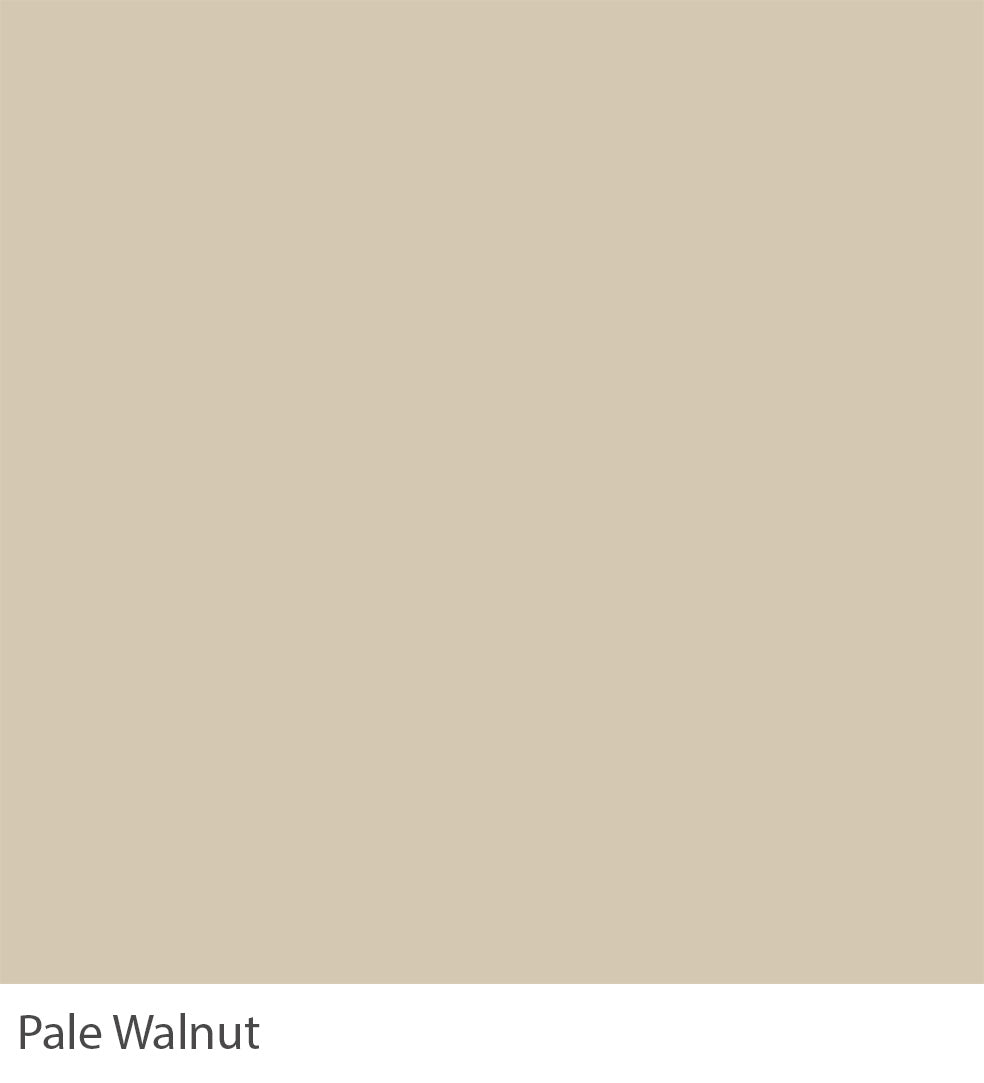
PALE WALNUT
Echoing the gentle hues of dawn in the countryside, Pale Walnut offers a calming presence in living areas. Paired with muted greens and earthy terracotta, it creates a space that feels grounded and ethereal, inviting moments of quiet contemplation and connection with nature. Pale Walnut is often used alongside lighter shades like Porcelaine for a restful space or paired with Suede for a wonderfully relaxed feel.

PARMESAN
Reminiscent of the vibrant hues of Italian frescoes, Parmesan transforms living spaces into havens of warmth and creativity. Try contrasting with Chiffon or White Linen on ceilings and woodwork. This colour’s sunny disposition encourages a life lived fully and joyously.

PEARL BARLEY
A subtle cool white inspired by the pale hues of grain fields at dawn, Pearl Barley brings a serene, natural simplicity to living rooms. It’s particularly spectacular when used in Eggshell within stainless steel kitchens or paired with Glacier for an uncompromisingly modern finish. With its understated elegance, this colour transforms any room into a haven of peace and harmony.
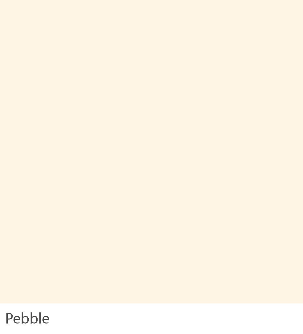
PEBBLE
Echoing the smooth, worn surfaces of river stones, red-based Pebble infuses dining rooms with a sense of natural grace and durability. When complemented by muted greens and soft blues, it fosters an environment that balances the serenity of nature with the comforts of home. It can be combined with Alabaster and Linwood to read pinker or with the darker Soft Smoke or Venezia on woodwork for a slightly aged look and relaxed feel.

PERIWINKLE
Drawing inspiration from the vibrant skies of summer, Periwinkle transforms bathrooms into serene escapes. Its clean, graphic feel works exceptionally well alongside Juniper and Ebony. When contrasted with Glacier on woodwork, it gains a regal edge, looking more profound and intense.

PEWTER
Inspired by the stately charm of Georgian silver, Pewter is the most versatile of our stronger accents, as it can be used with Argento and Suede or with neutral colours like Porcelaine. It is particularly effective for ground kitchen islands and creates fabulously sullen yet warm rooms when used on the walls of smaller spaces.

PIGEON
Pigeon transforms kitchens into sleek, sophisticated spaces by echoing cityscapes’ hues. Cooler and cleaner in feel than Pewter, this neutral is trendy in hard-edged contemporary homes conducive to minimal living and is often used alongside the more dramatic Graphene.

PLOVER
Inspired by the lightness of the sky at dawn, Plover offers a serene backdrop for home offices. This soft and classic tone perfectly suits children’s bedrooms, especially when contrasted with Blue Steel on furniture or woodwork.

PORCELAINE
Porcelaine draws inspiration from the refined beauty of 18th-century French ceramics and brings timeless elegance to living spaces. This calm tone hints at grey, making it perfect as a wall colour for a neutral contemporary space. It can also be used on ceilings and woodwork when combined with cooler greys.

PORPOISE
Inspired by the serene depths of the ocean, Porpoise infuses bathrooms with a sense of peaceful solitude. It can be contrasted with sympathetic Pearl Barley or used with darker Pigeon or Pewter.

POWDER BLUE
Evoking the clear skies of a perfect summer day, Powder Blue transforms bedrooms into havens of tranquillity and light. It creates the perfect period feel when contrasted with Porcelaine. With its boundless optimism, this colour is a favourite for those who prefer a clean and crisp finish.

PROVENCAL
Inspired by the golden hues of Provencal sunsets, this yellow-based colour transforms kitchens into welcoming spaces that spark culinary creativity. A darker and more yellow version of Straw should never be used with a bright white but with a sympathetic yellow-based like Chiffon to create a gentle warmth and charmingly traditional scheme.

PRUSSIAN
Drawing from the regal elegance of military uniforms, Prussian imbues living rooms with a commanding presence. Although traditional in feel, it is often used as an alternative to Grape to create a richly dramatic space with a more contemporary finish. With its historical depth, this colour evokes a sense of timeless dignity, offering a backdrop for grand and grounding gatherings.

SADDLEBACK
Echoing the sturdy grace of equestrian leather, Saddleback transforms bedrooms into retreats of quiet strength and luxury. It is the perfect accent colour for Clotted Cream or can be used on woodwork with rich Vintage. This colour’s blend of warmth and depth invites a sense of timeless well-being.
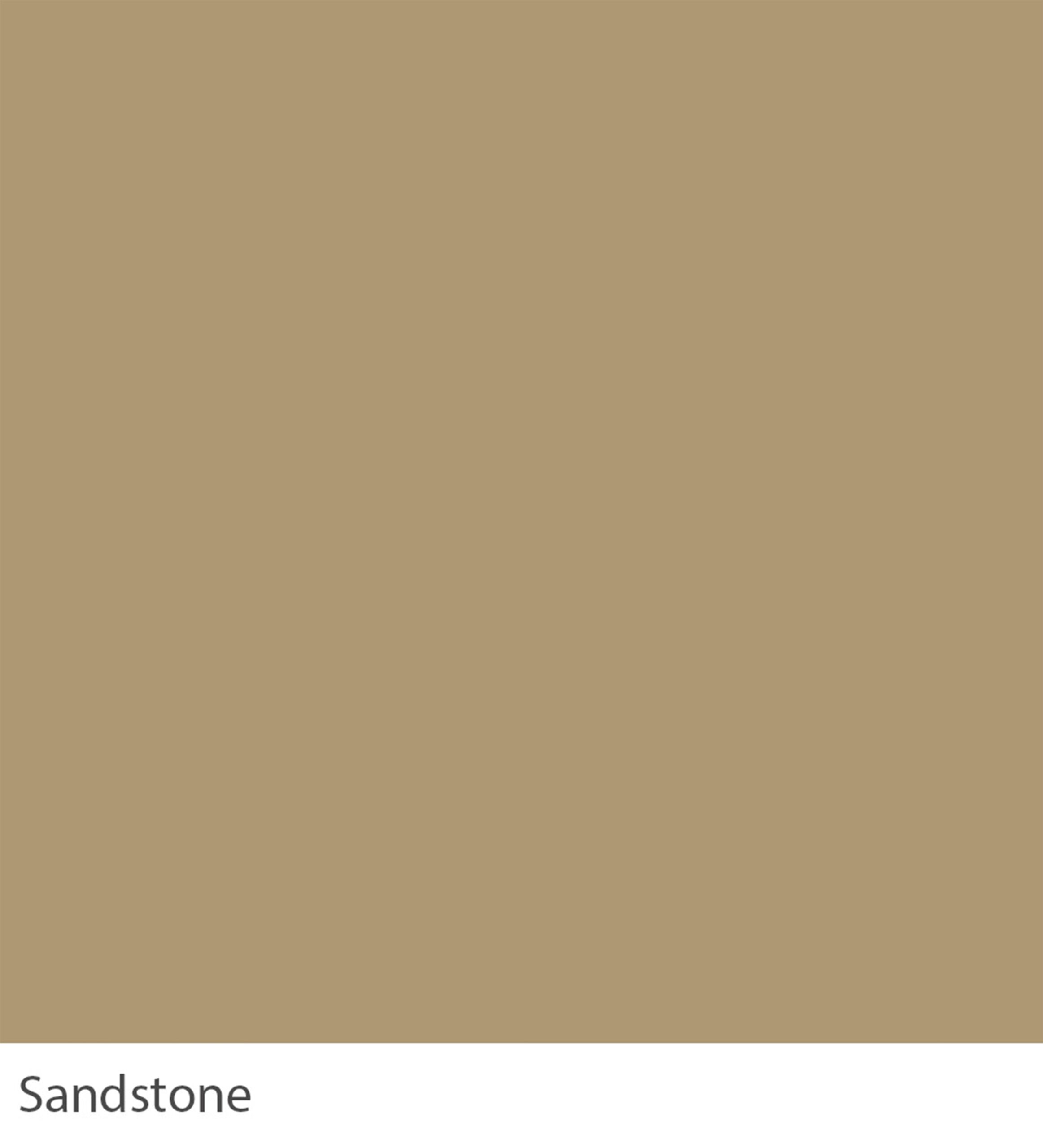
SANDSTONE
Inspired by the majestic landscapes of the desert, Sandstone transforms bathrooms into serene oases. A yellow-based neutral with brushed gold fixtures and creamy linens creates a spa-like environment that soothes the senses.

SEA FOAM
Echoing the playful spirit of the seaside, Sea Foam enlivens kitchens with its vibrant, refreshing hue. It is often used as an accent colour alongside Pearl Barley or Porcelain. This colour, reminiscent of gentle waves and clear skies, offers a daily escape to the shore, where every meal feels like a sunny beach picnic.

SESAME
Inspired by early dawn’s soft, muted glow, Same transforms hallways into welcoming passages of light and warmth. It has an enduring feel, and when combined with White Pepper or Alabaster, it becomes sophisticated and understated. With its understated charm, this colour is a canvas for life’s small, precious moments, offering a backdrop of gentle grace and timeless elegance.

SIENNA
Echoing the rich tones of Tuscan landscapes, Siena brings warmth and inspiration to living rooms. Less of a true, sunny yellow than Parmesan, this colour creates a feeling of instant warmth, especially in rooms with little natural light. Reminiscent of sun-drenched fields and ancient villas, it offers a daily retreat into the heart of Italy’s artistic and culinary heritage.

SILVER BIRCH
Inspired by the ethereal beauty of winter forests, Silver Birch transforms living spaces into luminous realms of calm and light. Accented with icy blues and muted greys, it invites quiet reflection and elegance, evoking the silent grace of snow-covered landscapes.

SILVER MOSS
Echoing the lush vibrancy of early spring foliage, Silver Moss is a refreshing, green-lightened version of Artichoke. Its paleness is calming, so it is well suited to kitchens to create a contented family atmosphere. This colour, reminiscent of new beginnings and the awakening of nature, transforms everyday spaces into areas of blossoming possibilities and fresh starts.

SOFT SMOKE
Inspired by the hazy outlines of distant mountains, Soft Smoke transforms bathrooms into serene escapes. Used as the backdrop to numerous costume dramas, it creates the perfect period feel when contrasted with White Pepper. With its blend of calm tranquillity and subtle depth, this colour mirrors the peaceful solitude of a morning mist, inviting moments of quiet reflection and renewal.

STONE
Echoing the enduring strength of ancient towers, Stone imbues living rooms with a foundation of quiet confidence. Sitting between Grape and Graphene, its subtle blue undertones work particularly well in modern architectural spaces. With its timeless appeal, this colour creates a space that is both a sanctuary and a place of dynamic engagement, reflecting the layered complexities of life.

STRAW
Inspired by the golden fields of the countryside, Straw brings a touch of pastoral charm to bedrooms. It feels just as at home on the panelling of a 17th-century hall as on the wooden cupboards of a relaxed family kitchen. With its sunny disposition, this Colour transforms spaces into havens of comfort and joy.

SUEDE
Echoing the luxurious texture of its namesake, Suede transforms home offices into spaces of refined comfort and focus. Try offsetting an invitingly earthy scheme with Burmese with more intense accents, or pair it with Stone or White Pepper for a sense of neutrality and calm. With its balance of warmth and sophistication, this colour creates an environment supporting work and well-being, reflecting the modern desire for a harmonious life.
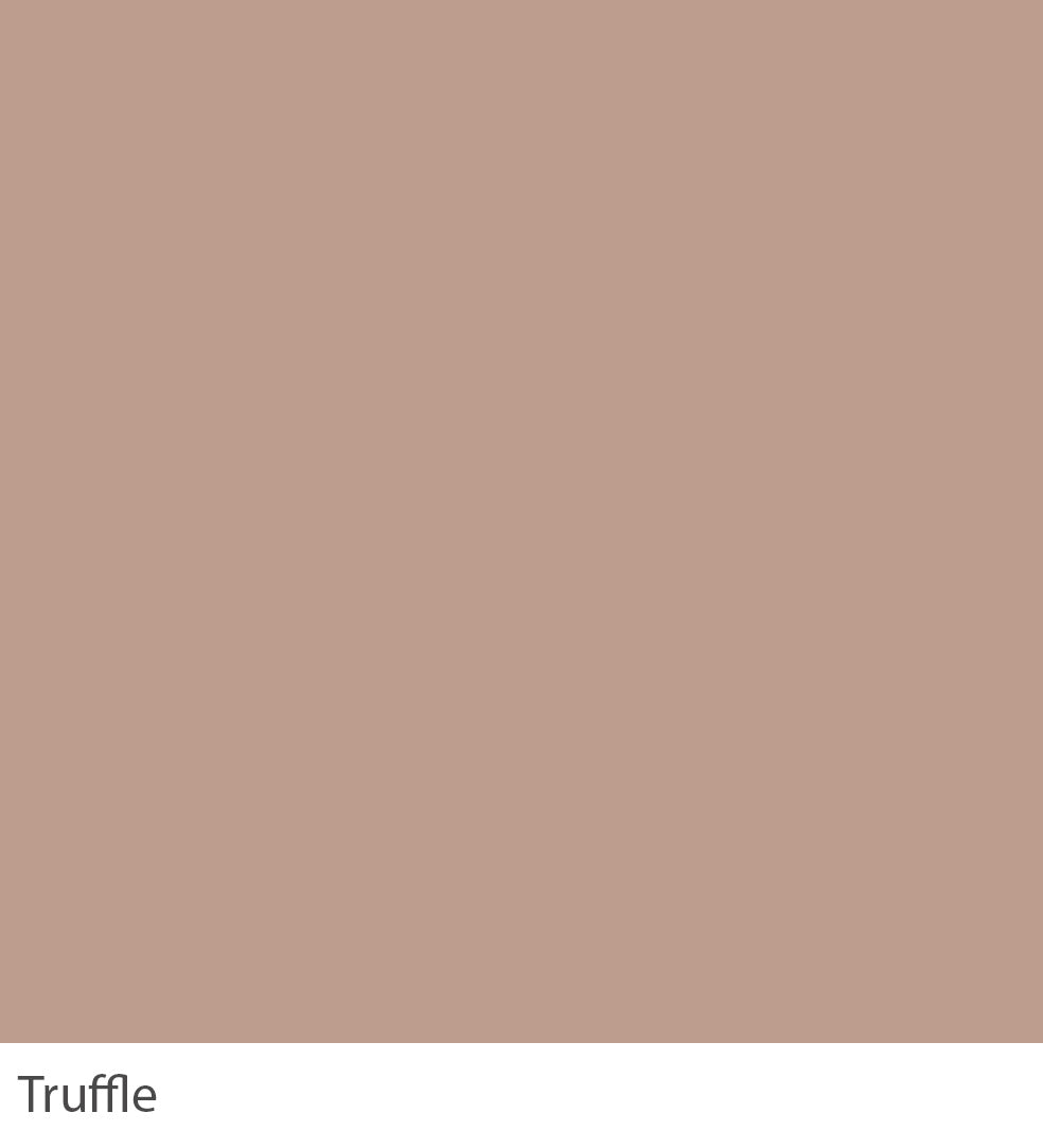
TRUFFLE
Inspired by the earthy richness of woodland fungi, Truffle brings an element of the forest’s hidden beauty to living rooms. It is a darker version of Pale Walnut and is perfect for those hoping for a warm grey finish. Pair with Linwood for the most flattering and subtle scheme. This colour’s subtle complexity encourages a deep appreciation for nature’s understated yet profound beauty.

TUBEROSE
Drawing inspiration from the fragrant blossoms of its namesake, Tuberose transforms nurseries into serene, floral retreats. This light pastel tone is fresh and uncomplicated, especially when contrasted with Glacier, for a gently playful feel. Try pairing our Cinnamon with Amchoor for a slightly cleaner urban finish.

TUSCAN RED
Inspired by Tuscany’s vibrant landscapes and rustic villas, Tuscan Red transforms bedrooms into spaces of passion and depth. With bold yet earthy tones, this colour was popular in dining rooms in the mid-19th century and reads almost like a saturated purple if you compare it to the more modern-looking Cinnabar.

VENEZIA
Echoing the enchanting hues of Venice’s canals, Venezia infuses living spaces with a sense of adventure and discovery. Venezia’s lively and saturated colour can be used alongside warmer tones, such as Soft Smoke, to create an inviting vintage look or the more relaxed Powder Blue for a cleaner, more contemporary feel. With its dynamic and inviting quality, this 18th-century colour transforms the home into a haven of creativity and inspiration.

VINTAGE
Inspired by the worn patina of antique treasures, Vintage brings a layer of history and character to living rooms. It sits contentedly in a calming scheme with Ashen, Argento, and Pale Walnut in old and new homes. With its subtle depth and rich heritage, this colour invites a celebration of the past as a treasure trove of inspiration for the present.

WARDOUR BLUE
Inspired by the clear skies above the English countryside, Wardour Blue transforms bedrooms into serene escapes. This fresh mid-blue, typical of a formal Regency hue, sits happily alongside similarly clean White Linen and Arctic. With its tranquil vibrancy, this colour encourages a connection to the natural world, offering a daily reminder of the simple, refreshing beauty of the sky.

WHEATBERRY
Wheatberry infuses living rooms with a sense of calm and abundance, echoing the soft hues of harvested fields. It has an enduring feel, and when combined with Old Bone and Saddleback, it becomes sophisticated and understated. With its understated warmth, this Colour transforms spaces into havens of comfort and gentle elegance.

WHEATEN
Inspired by the muted tones of dried grasses, Wheaten brings a touch of the earth’s tranquillity to dining areas. It can be combined with Latte or Dijon to read pinker or the darker Burnt Umber on woodwork for a slightly aged look and relaxed feel. This colour, reminiscent of the gentle transition from summer to autumn, invites a sense of warmth and gathering, making every moment at the table an occasion to cherish.

WHISPER
Echoing the delicate hue of the morning sky, Whisper transforms bedrooms into sanctuaries of rest and renewal. This colour comes into its own when contrasted with Glacier. With its subtle whisper of green, this colour invites a sense of calm and clarity, making every room retreat from the world’s clamour.

WHITE LINEN
Inspired by the freshness of sun-dried linens, White Linen envelops bedrooms in a cocoon of comfort and simplicity. It is a contemporary neutral palette that can be paired with Wheatberry and Pale Walnut for a warm scheme with a slight edge. Contrast with fresh, strong tones like Indigo and Oxford for a clean, almost graphic finish.

WHITE PEPPER
White Pepper brings a serene, understated elegance to kitchens by echoing the crispness of early frost. This colour comes into its own when contrasted with Glacier. With its hint of coolness, this colour offers a backdrop of subtle sophistication, making every moment in the space a breath of fresh air.

WHITE SAGE
Inspired by the ethereal light of dawn, White Sage transforms nurseries into serene sanctuaries. This soft and classic tone perfectly suits children’s bedrooms, especially when contrasted with Blue Steel on furniture or woodwork. With its whisper of green, this colour mirrors the peaceful essence of sage, offering a retreat into tranquillity, where every day begins with a moment of gentle reflection and renewal.

WHITE TEA
Drawing inspiration from the delicate aroma of its namesake, White Tea infuses dining rooms with a sense of lightness and rejuvenation. It will look greener when used in contrast with White Pepper and in north-facing rooms. With its subtle green undertones, this colour invites a connection to the natural world, making every meal an occasion to savour the earth’s bounty.