
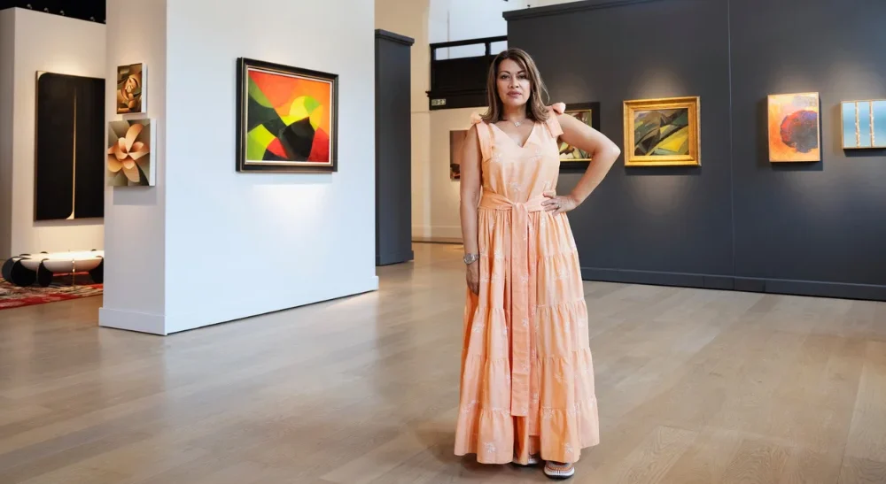
We are delighted to be the Paint Partner of the Eye of the Collector exhibition. Here we interview its founder, Nazy Vassegh, who offers her vision and experiences that shaped this event.
Behind the Design: Q&A with Kelling Designs
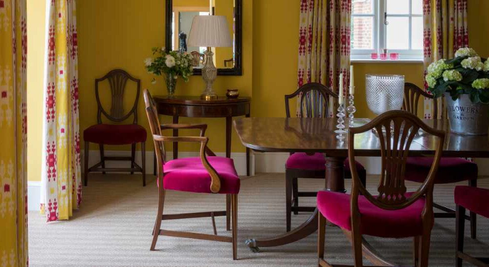
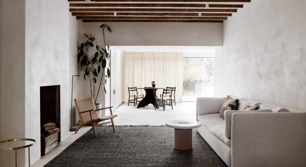
In our conversation with Kelling Designs, we explored their strategy for modernising a historically significant Grade II listed Norfolk farmhouse. The owners, residing on the same estate, aimed to reconfigure the layout to better suit their lifestyle while preserving the building’s heritage dating back to the 1500s. Collaborating with interior designer Emma Deterding from Kelling Designs and LBR architects, Kelling Designs oversaw the process of stripping the house back to its brick foundation and replastering and painting it anew.
They emphasised the importance of understanding the clients’ aspirations in guiding their design decisions and discussed their careful selection of eco-friendly paints, highlighting the necessity of preserving the building’s historical integrity while transforming its interiors. This discussion shed light on the planning and attention to detail required for such a transformative project.

- How did you approach integrating period details dating back to the 1500s into the modernised design?
The architect had done a lot of work on the modernisation of the house before we were hired. When we came on board, we made some further alterations to other areas and suggested a few additional tweaks to make the spaces work better, helping to ensure the design was suited to modern-day living. We believe it is key to understand how people are going to live in their house. After listening to our clients’ needs, we can draw on 30 years of experience in the business, to tailor our recommendations and advice.
- How did you work on creating a thoughtful flow throughout the property, and what were the key considerations in reconfiguring the layout?
One of the core areas we think about during the planning stages is the use of colour. Kelling Designs are known for our bold use of colour and pattern to create vibrant and uplifting spaces – to achieve this we carefully plan our schemes using colour to link from room to room. It is a fundamental factor in creating a cohesive feel throughout the home.
- How did you collaborate with the clients to understand their vision and preferences for the upgraded farmhouse?
We went to their existing home and had a good look around, getting to know them and how they live. We saw the furniture they wanted to take with them, as well as the artwork they had. We got them to show us their Pinterest boards where they had collated ideas and elements they liked, as well as magazines to get an idea of the kinds of designs and features they wanted to include in the project. But more importantly, we spoke to them about their aspirations for the house. This helps to make the process really collaborative, and allows us to make the right and relevant suggestions for them – sometimes pushing them out of their comfort zone where we felt it might be needed.

- Given the historical nature of the farmhouse, how important was it to use breathable paints in the restoration process?
It was very important to us and the listed building officer that the paints we used were breathable and sensitive to the nature and history of the building, so Graphenstone was the perfect choice. The whole house had to be rebuilt using materials and techniques that were sensitive to the building and that allowed it to breathe.
- How was the overall application experience of Graphenstone Paints during the restoration process?
It’s an interesting question as I did ask a few of the decorators whether they liked the paints – and they all seemed to be pleased with the application. We often have instances and certain brands where the decorators are not happy.

- Could you share specific instances where our team’s support made a notable difference in the project’s execution or decision-making process?
The whole team was great in supporting us, particularly the magic men who mix and create the colours. We often wanted the paints tweaked to the right shade for our schemes and they were happy to experiment and help us. They were never angry if we asked for another batch if it didn’t quite work – they were so accommodating and this made the whole process much easier.
- In retrospect, is there anything you learned from using Graphenstone Paints in this historical restoration project that might influence your approach to future projects?
I am fascinated by the concept that if you use enough of the paint, you begin to absorb CO2 which has to be healthier for us in the context of a home. As we learn more about how to be sustainable and good to the planet, it must make sense to use paints that are kinder to the environment and better for our clients’ health.

For additional assistance and guidance with your own projects, feel free to reach out to our team. Also, don’t forget to follow @kellingdesign on Instagram for a stream of design inspiration and ideas.
Related Posts


This Post Has 0 Comments