In this month's blog, we're excited to share insights from our conversation with interior designer Louisa Grey, founder of House of Grey, a London-based studio known for its holistic approach to interior design.
Thirty points – colour beyond aesthetics
Thirty points of difference
Written by Justine Fox, Studio Justine Fox
Creating harmonious inclusive palettes.
Forefront in challenges for interiors designers and architects in creating welcoming and comfortable environments for people through colour, is how to develop good-contrast palettes that are easy to navigate and retain a sense of beauty without over-stimulating the senses.
Currently one in seven of us in the UK is considered neurodivergent. The percentage of us experiencing moderate to severe visual impairment has reduced globally over the last 30 years. However, the actual numbers are going up due to our growing and aging populations and is thought could reach 588 million by 2050.
Put simply, we have an extraordinary and diverse human community, we are a valuable resource and need our designed world to be accessible in different ways. This may not be the exact same experience for everyone, but every interaction should be equally enjoyable and supportive to all.
Accessible contrast
So, what constitutes accessible contrast? Recently I spoke with a senior systems designer from the Home Office who explained the rationale behind the UK government comms colour palette. The function of the palette is to deliver clear accurate information to everyone quickly and efficiently, so they employ the highest contrasting colours black and white throughout. Yellow is used for its high visibility as the single highlight colour.
However, this is to impart information through digital and printed channels, when we apply this level within spatial design it can become a very uncomfortable, even stressful space.
We have guidance existing as Part M of the Building Regulations for England and the more detailed, UK wide BSI BS 8300, updated in 2018 to help us navigate some of the practicalities needed to implement the Equalities Act 2010 into our design practice, but I know from conversations with designers that some find it difficult to marry need to beauty.
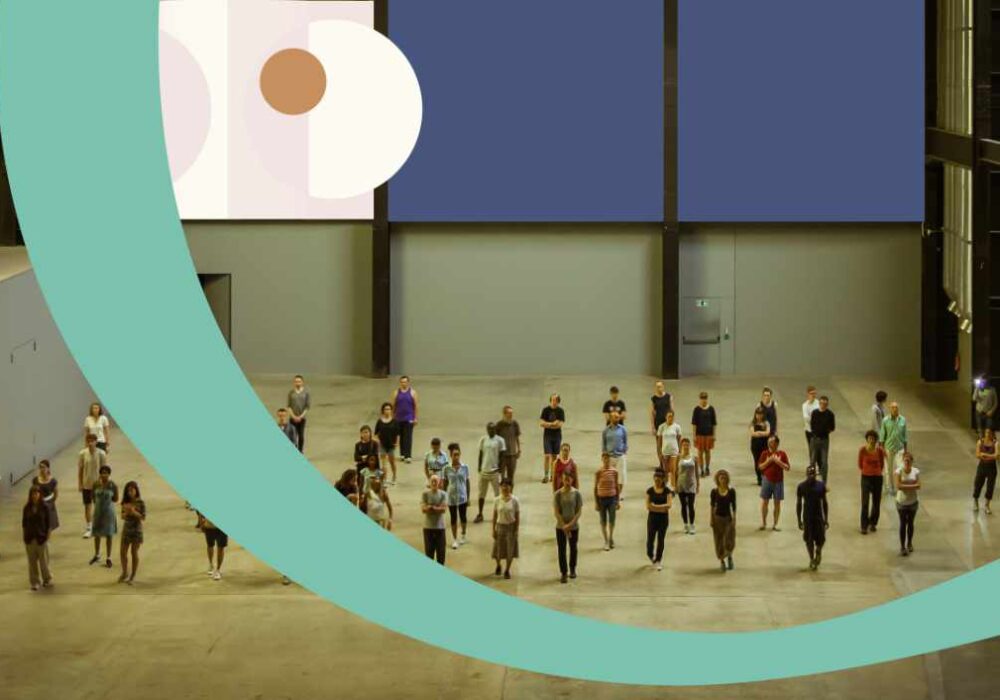
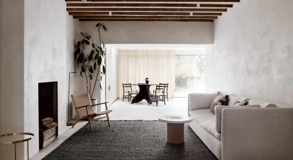
When we come into a space our eye looks to the area with the least visual interference for spatial clarity, in other words to read the room. This tends to be the ceiling and after that the first 1200 mm from the floor up, so these are areas want to have a very clear colour statement with low sheen, tonal, soft textures. Here we have the opportunity to set out the intention of the room through colour.
30 points of difference
Where these surfaces meet other substrates, like walls, but particularly at critical functional aspects like doors and stairs, guidance suggests that the optimum contrast for people to understand the space properly is 30 points of difference in light reflectance value (LRV). This is reliant on the ambient lighting giving an accurate render of the colour and on pieces like door furniture, we can bring this down to a minimum of 15 points different in LRV as the three-dimensional quality of shadowing helps acuity.
Steven Maslin, Principal Inclusive Design Consultant at Atkins, speaking to the RIBA Practice team, advises bringing visual calm to inclusive design, taking reference from biophilia and this is where the opportunities of harmony with applied colour psychology can do well. If you look at the qualities of naturally occurring palettes, you can recognise patterns in the ‘types’ of colour that exist together.
Interior design practice
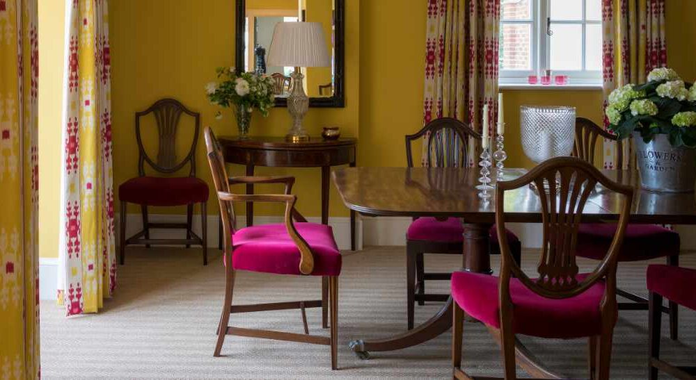
Interior design practice theories propose a proportional rule of 60:30:10 when devising a balanced spatial colour scheme, but within this we can break it down further using colours with similar LRV for gentle patterns and colour blocking or to accent important features and objects.
As humans, neurodiverse or neurotypical, with our spectrum of visual and physical abilities, we thrive in spaces that give us tempo and the freedom to use in the best way to support us and the activity that we are doing at that time. As designers these guides offer exciting parameters to push our creativity forward and make colour work for people.
Quiet Organic

Urban Garden

Say Hello

Flow Thought

- Tuberose 80 LRV, Alabaster 82 LRV, Silver Birch 80 LRV (Bengal 28 LRV)
- Jaipur 41 LRV
- Periwinkle 10 LRV
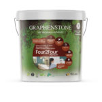
Studio Justine Fox has created four proportional palette plans based on 30 points difference LRV using sustainable, commercial brand Graphenstone Paints UK to explore some of the ways we can develop inclusive, beautiful, playful, quiet, and engaging spaces. You can see these below.
Studio Justine Fox is proud to be Graphenstone UK’s Built Environment Brand Ambassador.
Related Posts

This Post Has 0 Comments